Task's Demo
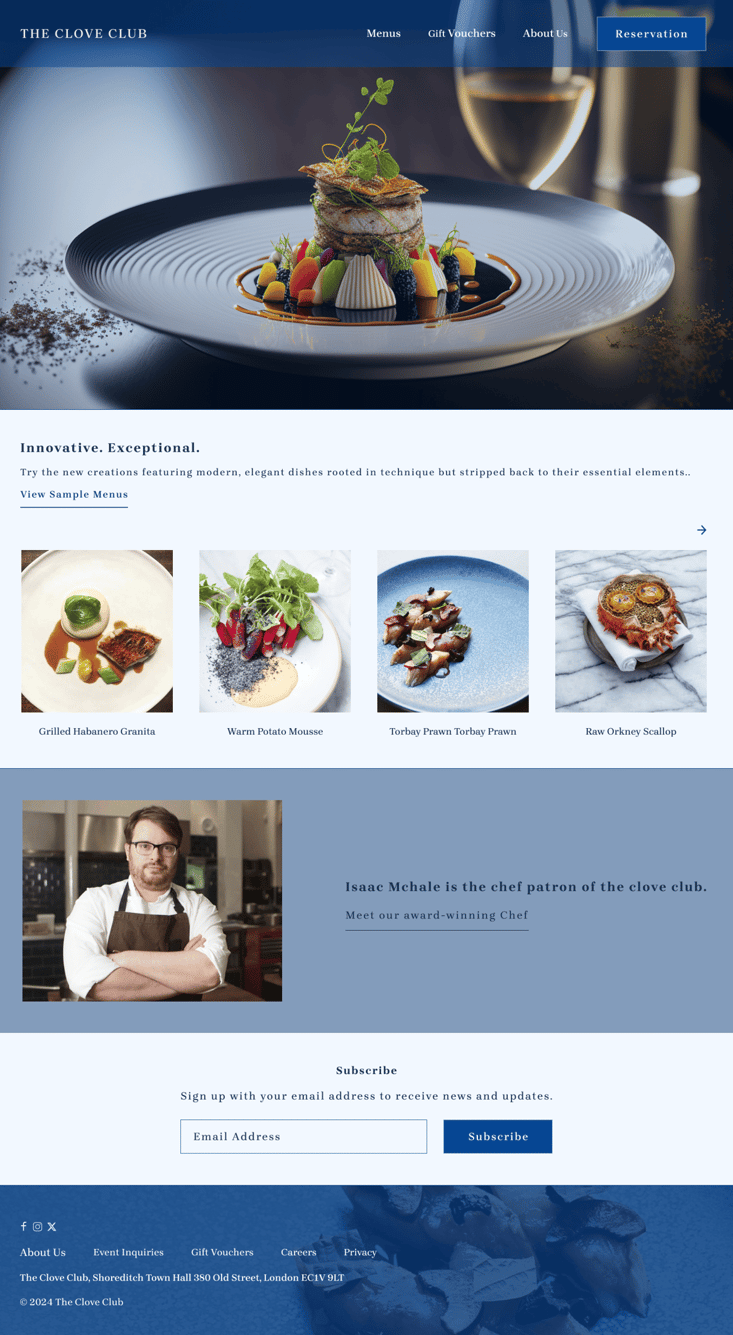
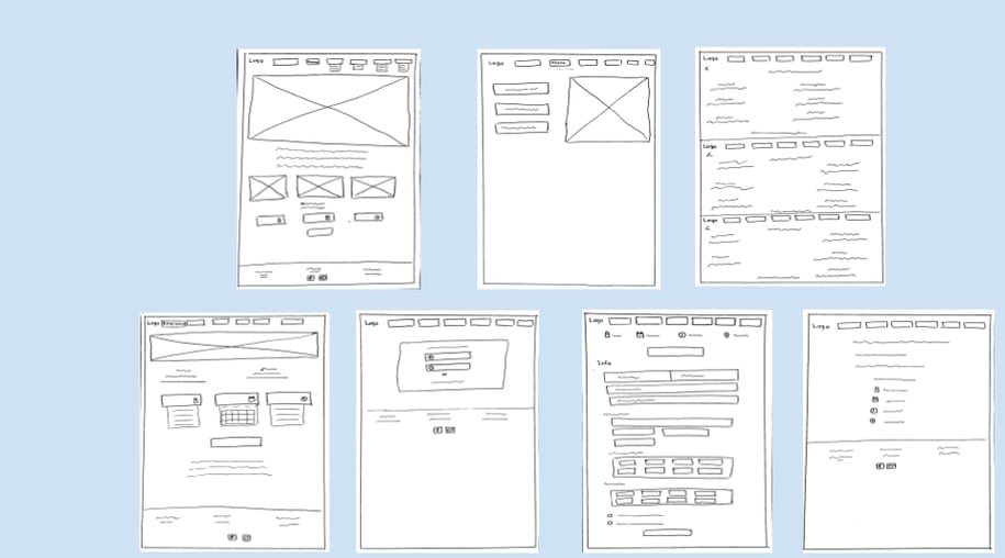
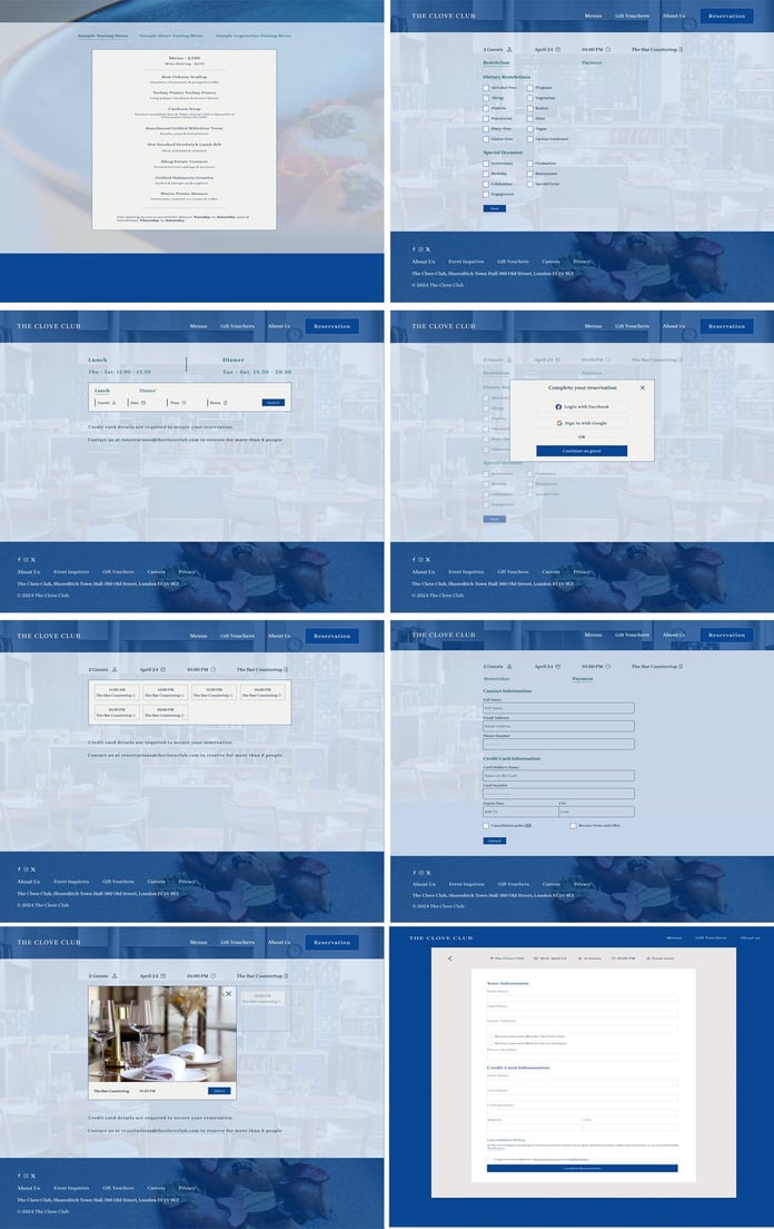
Our team designed high-fidelity wireframes and simultaneously started polishing every single screen to create a click-through prototype.

Over view
The Clove Club website did not show clearly the restaurant’s mission and services. However, to increase the engagement of Clove Club’s audience, the organization decided to improve how they present their values, goals, and activities on their website.
Goals
We must redesign a website for Clove Club to generate the most interest among potential users in the 2 MICHELIN Star Restaurant.
Show clear online reservations.
Gift card purchases
Menus and Beverage pairing
Subscribe to newsletter
increasing awareness about the chef
Problem statement
The Process
Discover Define Develop Deliver
Discover
Our research provides us with the opportunity to go beyond the users' immediate frustrations to analyze their hopes, fears, abilities, limitations, reasoning, and goals. Later, solutions can be developed based on these foundations.
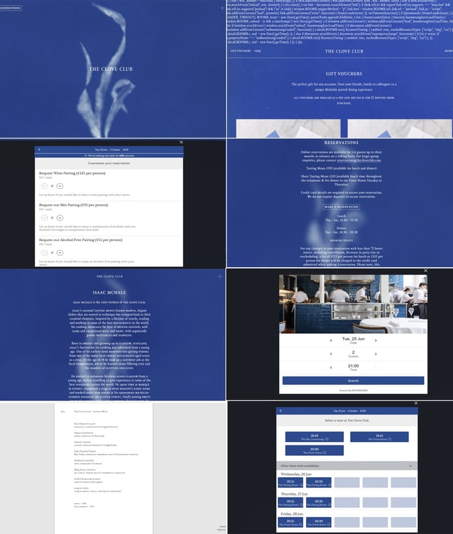
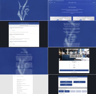
Heuristic Evaluation
Before doing user interviews, all three people in our team performed a heuristic evaluation of the website to discover the main usability issues and contributed to getting a better insight into what to focus on during the user research.
The website's redesign and content are outdated and many issues were noticed.
Competitive & Comparative Analyses
To better understand our target audience and their challenges, we created an online survey and interview and shared it with relevant communities. Based on the responses, we identified three common pain points, which guided our next steps.
Intuitive and user-friendly UX/UI design / Design optimization for improved user engagement
Website/App responsiveness
Accessibility and inclusivity considerations
Survey &Interview
What did we find?
On the homepage, it's not clear to visitors that this website is related to the 2 MICHELIN Star Restaurant.
Users cannot locate the navigation bar easily; there is a "+" on the right side of the page that appears after clicking.
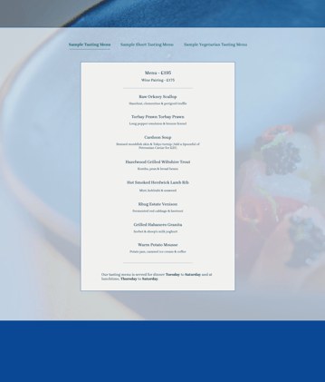
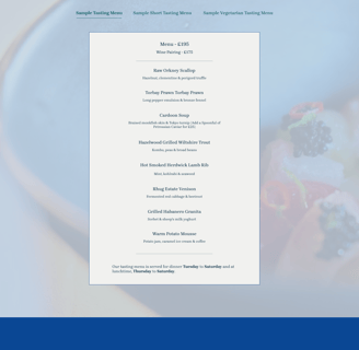
Menu pages are separate within a single PDF file, making it difficult to navigate back to other menus.
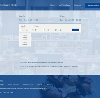
The reservation page is disorganized and doesn't facilitate easy booking.
When users try to select a time, both lunch and dinner times are listed together, confusing.
Each page contains categorized information, which can be overwhelming.
Chef and other important information are not prominently displayed on the main page.
The navigation bar lacks organization and there doesn't seem to be a site map available.
What can we do?
Create a redesigned homepage and navigation bar that includes essential information in each section.
Merge menu pages and create navigation links for seamless browsing.
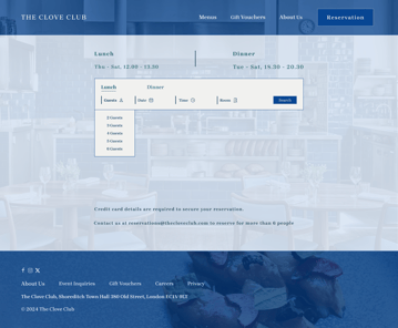
Simplify the reservation process on the website for easier booking.
Differentiate lunch and dinner times visually for user clarity.
Provide categorized and summarized information for improved navigation and understanding.
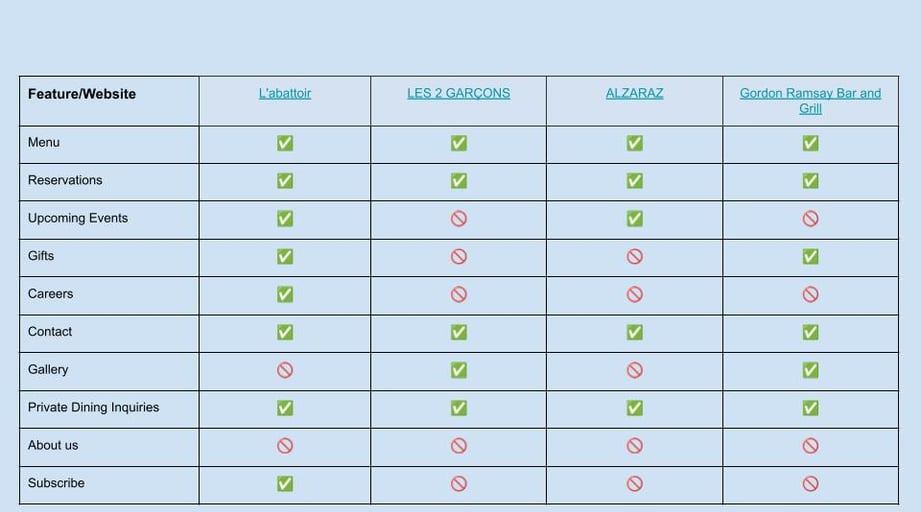
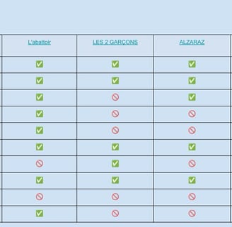
Thorough research of potential competitors led to the review of four similar websites targeting the 2 MICHELIN Star Restaurants across the world.
Ideation
Personas
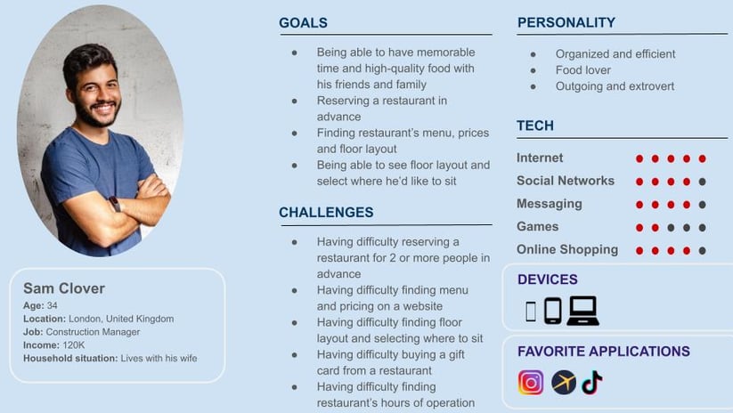
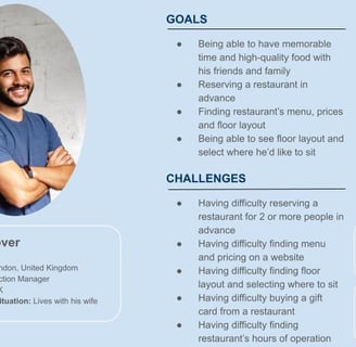
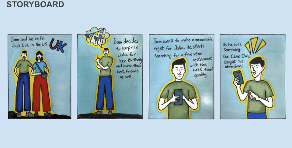
Our team developed a persona for our new project inspired by the characteristics of our target user, like Sam Clover, a 34-year-old construction manager from London. Sam values food and dining experiences that create memorable moments with family and friends, alongside traits such as discipline and organization. By aligning our design decisions with his preferences, we aim to craft a user experience that is both engaging and effective, resonating well with users similar to Sam.
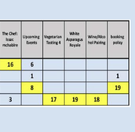
Cart sorting
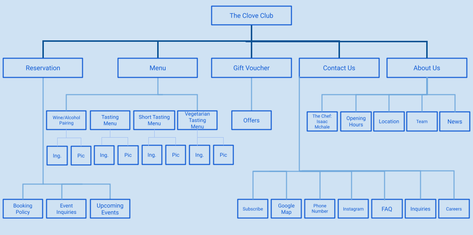
Site Map

We are redesigning the reservation tasks based on the user flow and previous information.
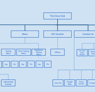

User flow
How do users think the website should be organized?
Design
Our UI kit balances casualness with a color palette of dark & light Blue & brown tones, and modern and easy-to-read fonts.
UI Kit
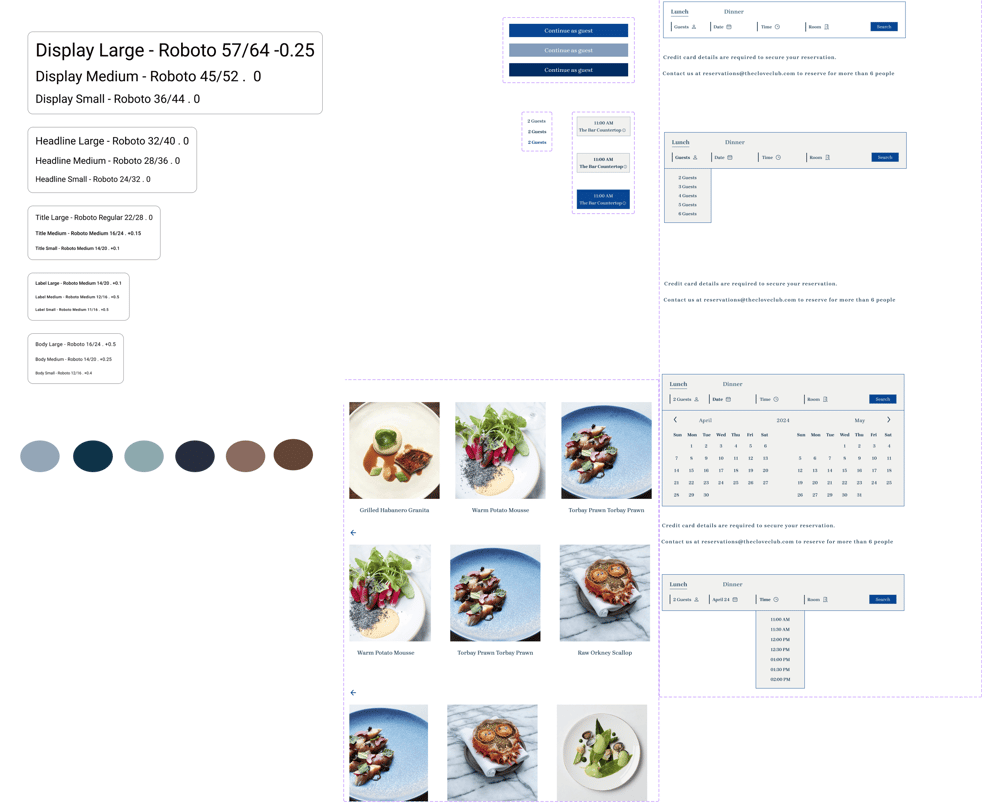
Low Fidelity Wireframe
High Fidelity Prototype
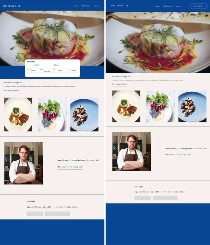
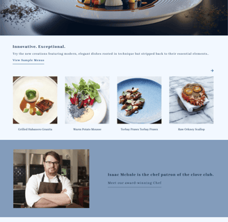
Main page before A, B testing
Reservation task
Usability Iterations
Following several usability tests with 12 potential users, we have made several improvements to our website based on the feedback and insights we received.
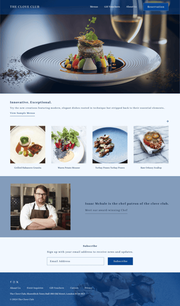
Home Page
1. During an A/B test, a preference We've discovered that positioning the CTA button on the upside of the hero image can attract the most attention. The hero image led to higher engagement and conversion rates, indicating that it was more effective in capturing the attention and interest of website visitors.
2. We changed most images, they will be more visual & user-friendly.
